
on CEntRal ceNTrAL
New-ish work, finally announced
"Why are you speaking to us about this project? You have many branding and design studios here in Bangkok." I asked.
"This is a bit of a sensitive project that I think you would be good for. I've seen the work you've done and how much emphasis you place on research and insights, and we want to understand how people are feeling about this place."
"Sensitive?"
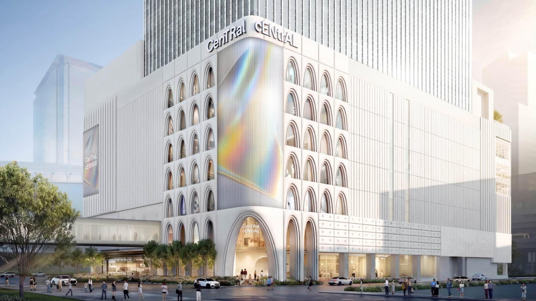
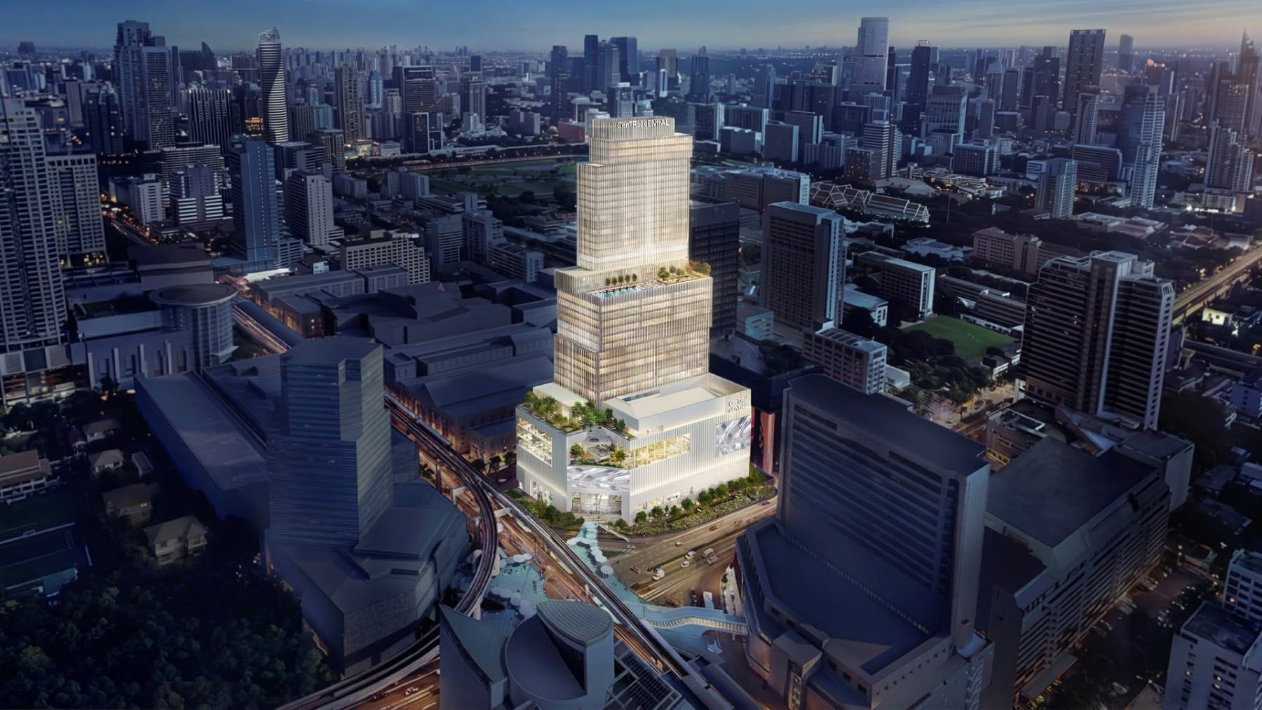
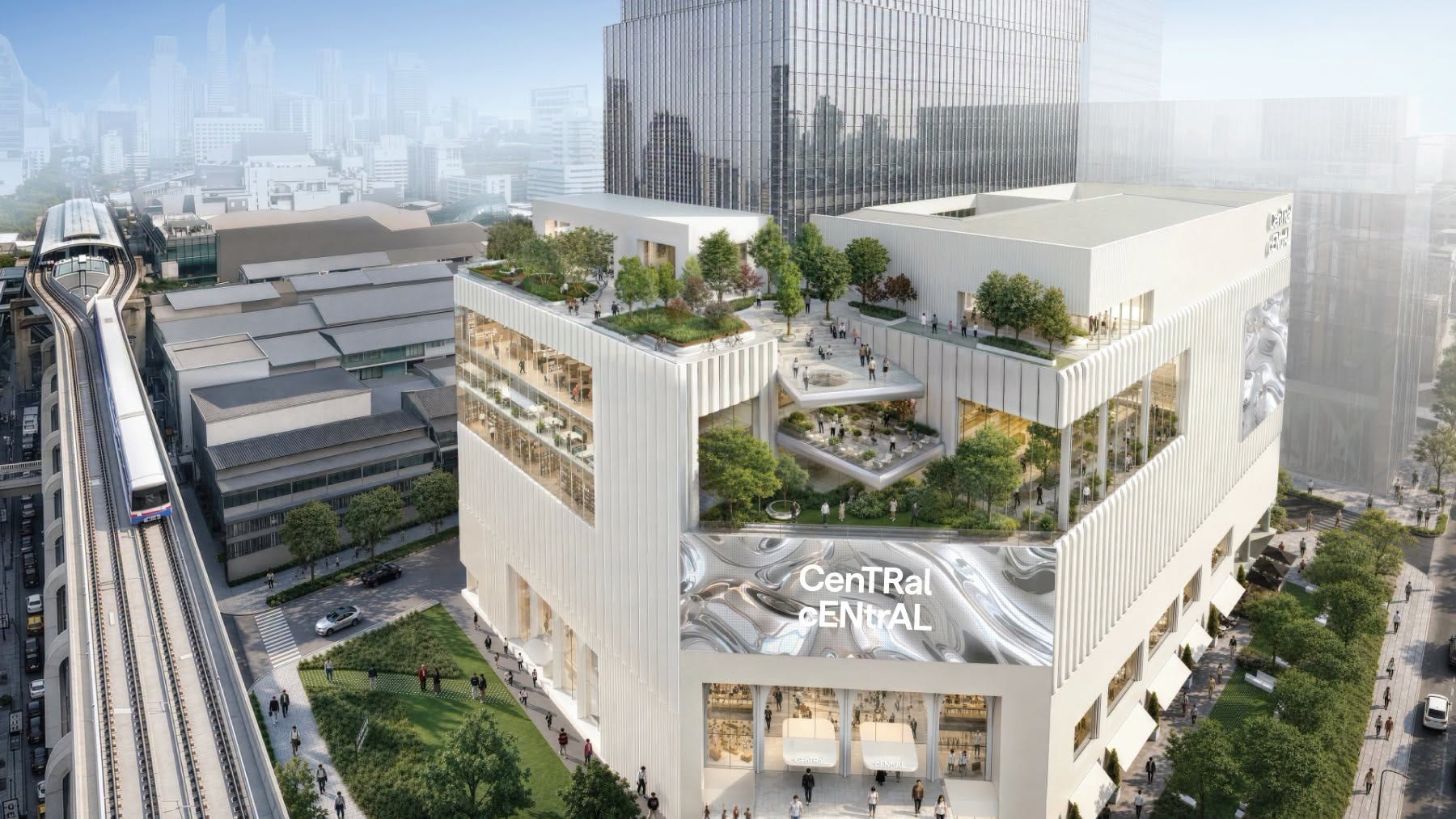
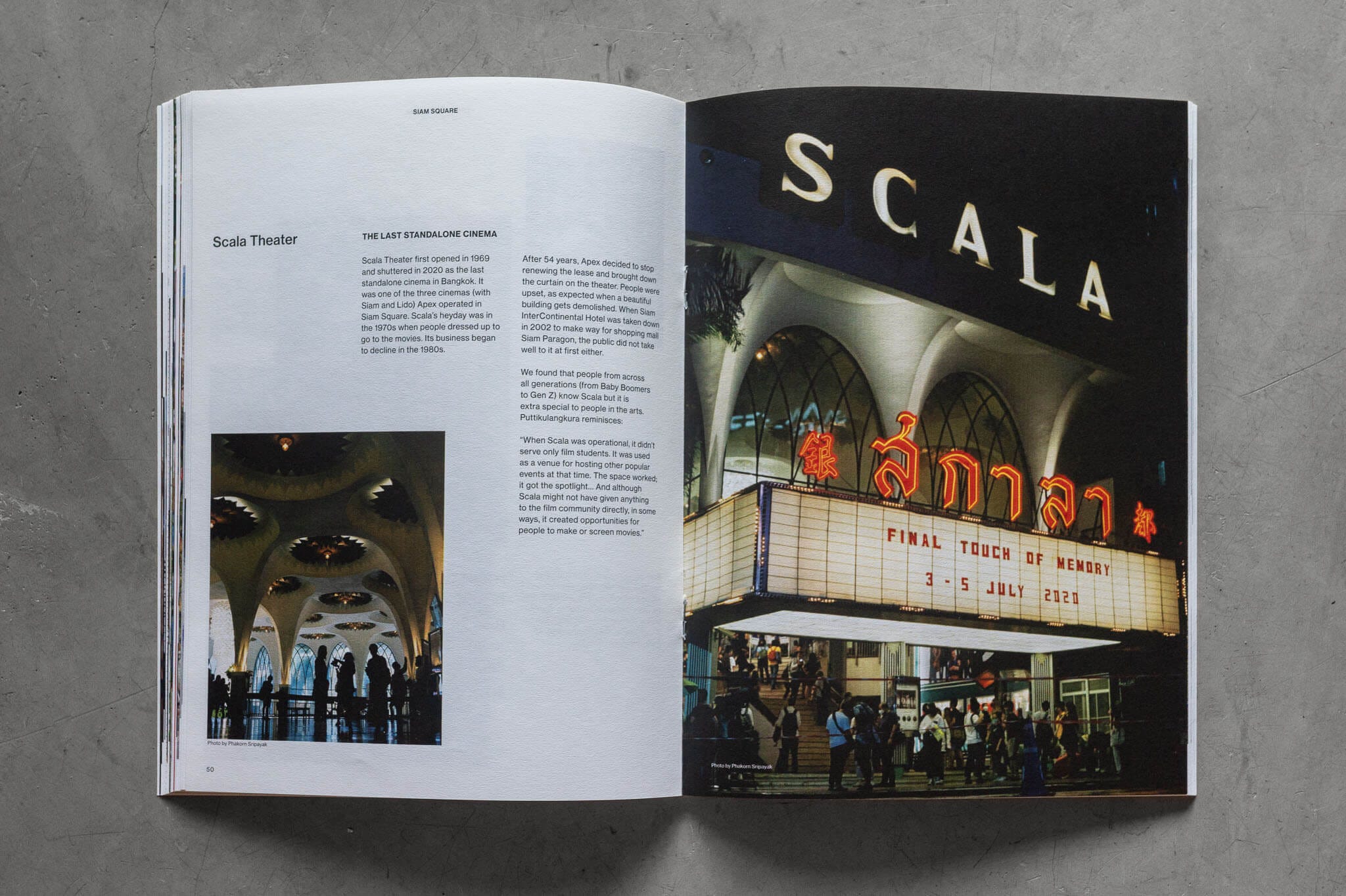
The brief was to name and develop the brand for a new mixed-use building in Siam Square, the centre of youth culture in Bangkok, and often called the centre of the city itself. The sensitivity came from what was there before. Scala Theatre, a much-loved cinema with a late-modernist exterior and art deco interior, had been demolished to make way for the new building.
Videos of tractors knocking it down circulated widely. Bangkok, as it turned out, was not happy about it. Those responsible had previously promised to retain as much of the original structure as possible, then changed their mind.
I knew this building. In 2017, we held A Design Film Festival there. Now we were asked to name what replaced it.
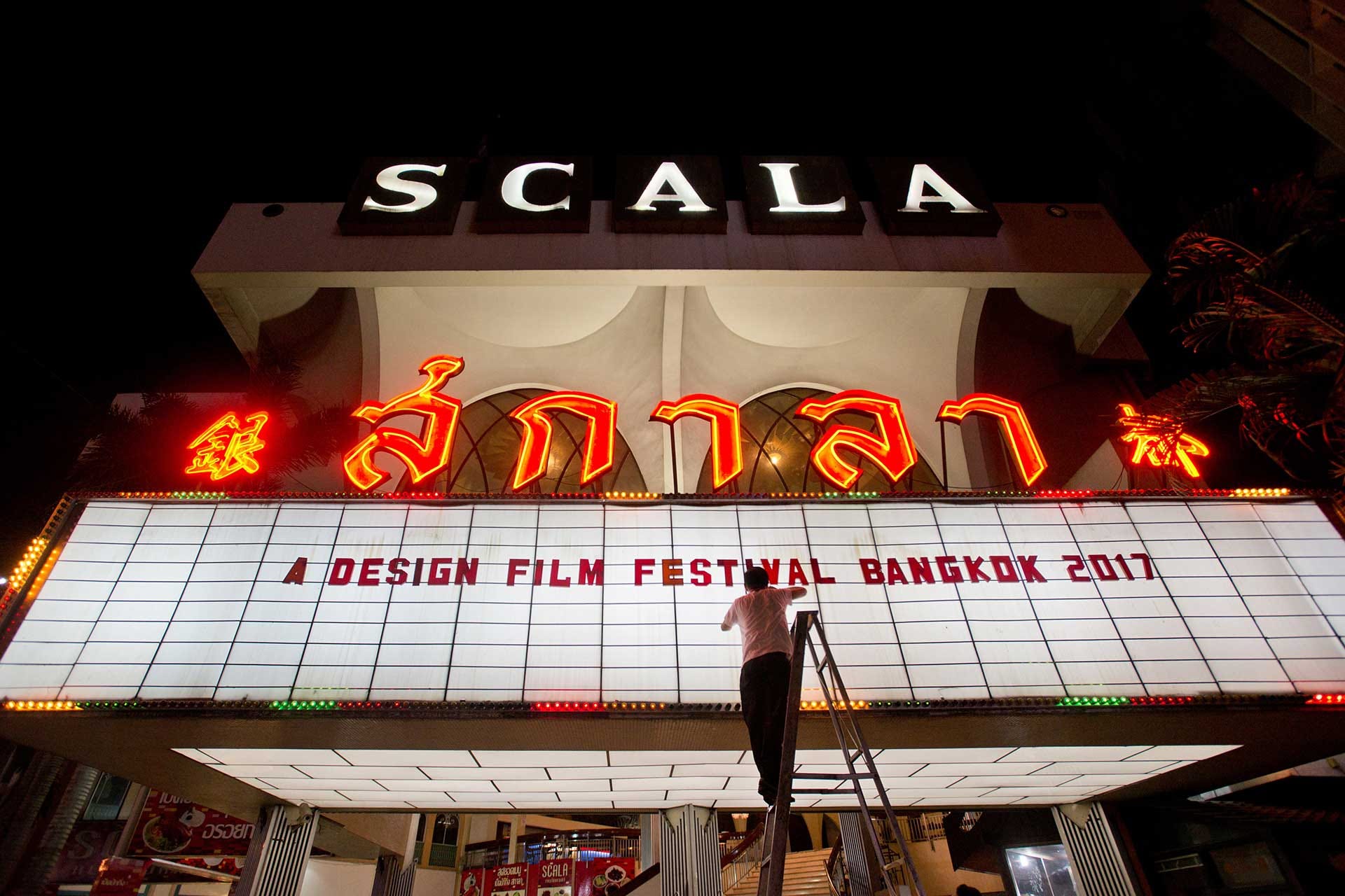
We took on the project for two reasons: one, we had never branded a mall or property before, and I have a try-everything-once approach to most things. Two, there was no pitch required. (In this profession, the second reason is always more persuasive than the first.)
This is the story of how a studio of two ended up branding one of the most anticipated, and contested, new buildings in the centre of the most visited city in the world.
Insights & strategy
This project was unique for a few reasons.
The location carried meaning. It wasn't just another plot of land where something forgettable had been replaced by something shinier.
For five decades, Scala had been where people went on dates, watched films, or maybe just spent an afternoon away from the heat in a thousand-seat cinema with a dozen other people. It was the last standalone single-screen cinema in Bangkok, with a grand staircase, chandeliers, and an entrance hall that felt closer to a cathedral than a cinema. On its last day, they showed Cinema Paradiso, a film about a beloved cinema being demolished to make way for something else. Whoever chose the film knew exactly what they were doing.
Which made replacing it… delicate.
It was the smallest project by the country’s largest property developer. The chairman had placed it at the top of the priority list. Partly because it was their first move into a neighbourhood long dominated by a competitor. Partly because the target audience was a generation of future customers.
Unlike the rest of their portfolio, which was built for everyone, this was aimed at a very specific audience: a new generation just coming of age. One that expected the brands around them to not just sell things, but to have a point of view.
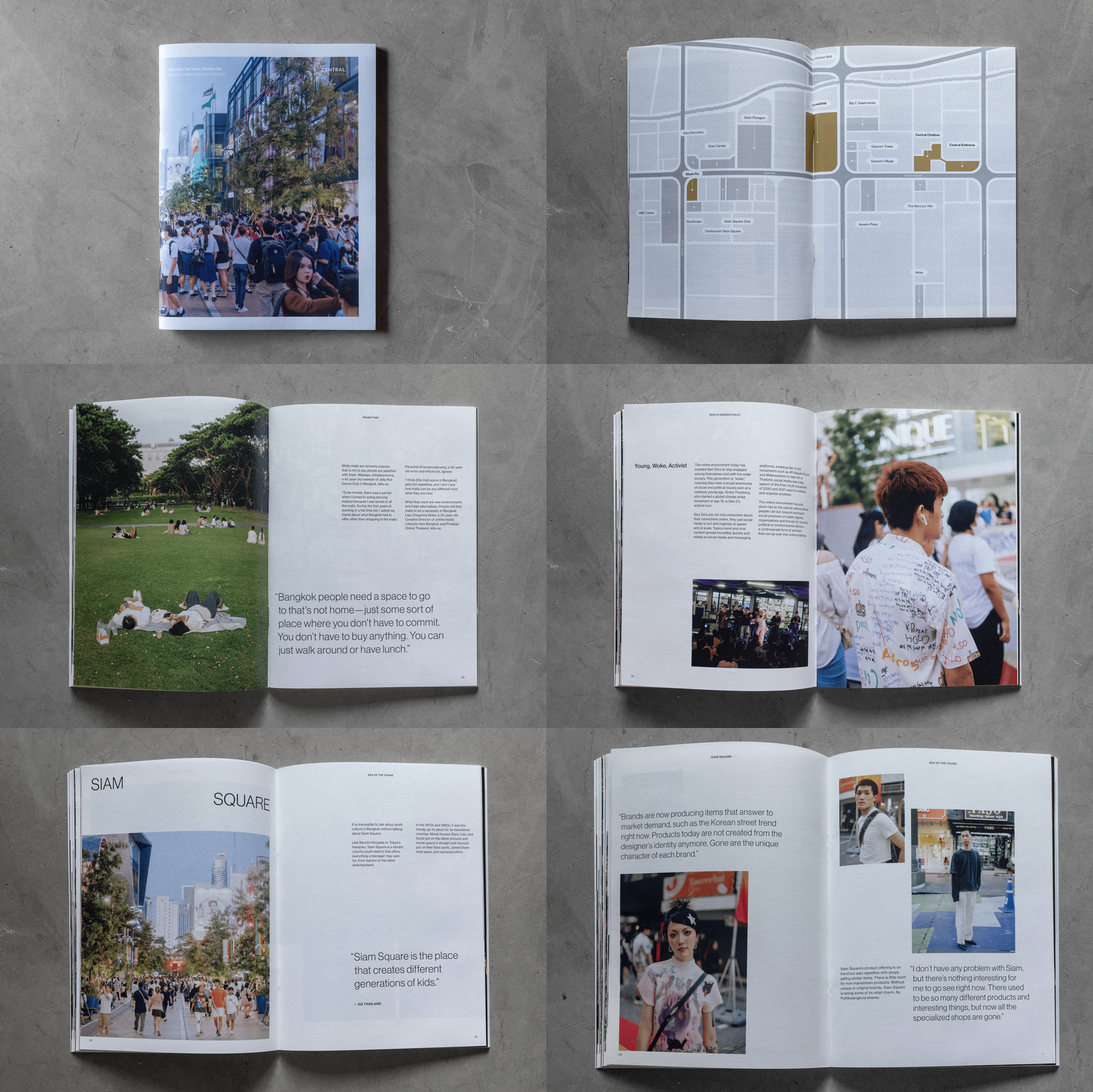
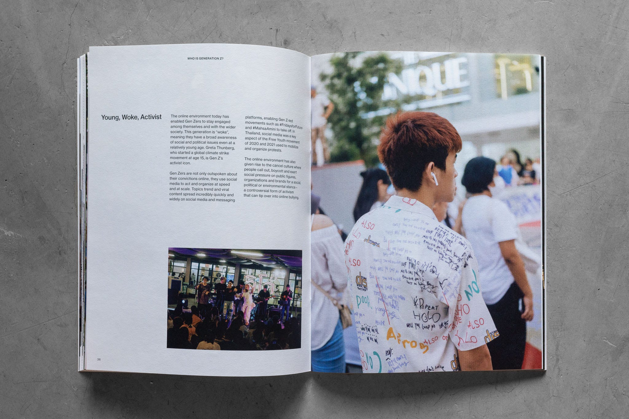
We started with three months of research. How did people, particularly the youths, feel about this location? What did they think of the brand? What were their dreams, hopes, and aspirations?
The research wasn't about how much time they spent in a mall, or which social media apps they used. It wasn't about collecting positive thoughts about the brand, or what they wanted in a shopping mall. Information that sounds useful but isn't, at least not for building a mental model of who you're designing for. We wanted to understand the cultural tension underneath the city. What people actually felt about this place.
I put together a small team: a local interviewer, a photographer, and a roster of subjects ranging from teenagers to creative professionals, artists, entrepreneurs, and everyday people. We studied the site for weeks. I travelled to Japan, Korea, and China to understand what Thai youths looked to for reference and inspiration. We went through books and articles on Thai history and culture. We interviewed the entire C-suite, the family behind the company, and the project team. We wanted to understand how the company saw the world, and how the world, particularly the youths of Bangkok, saw the company.
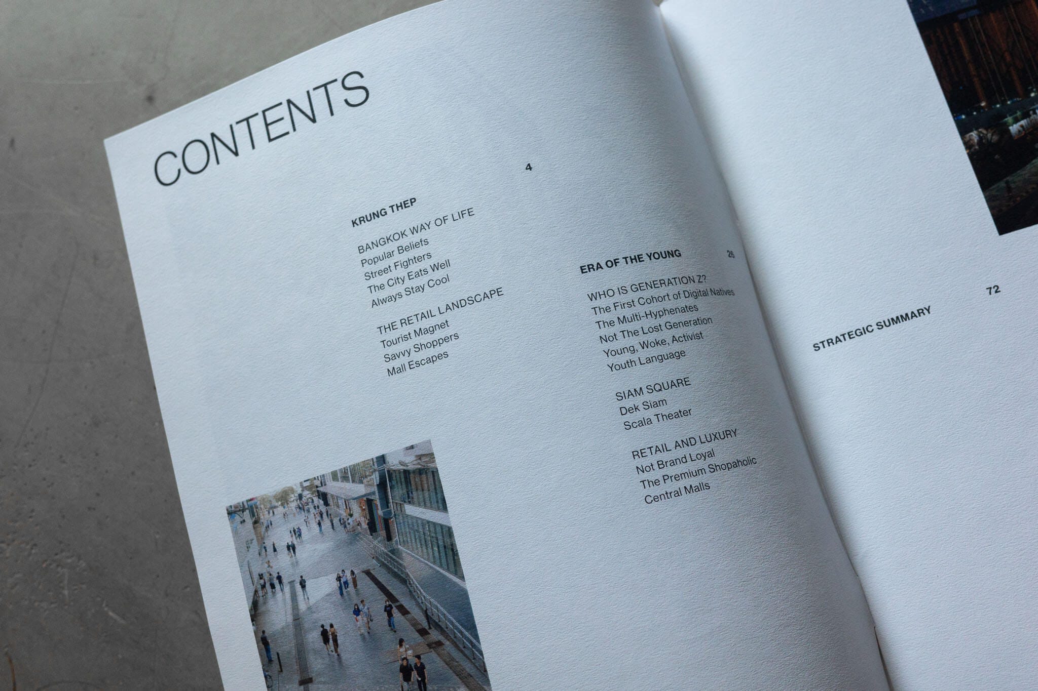
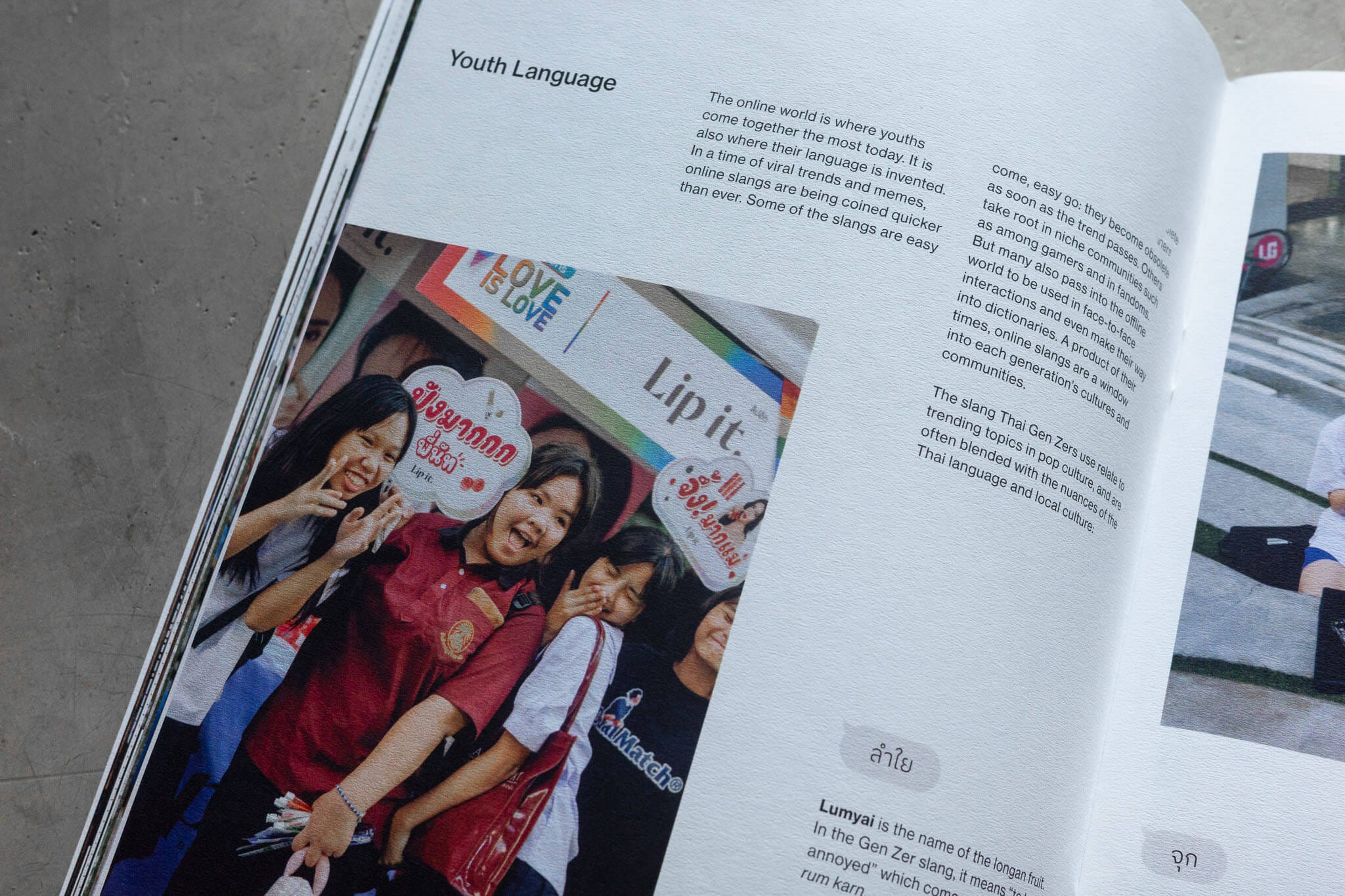
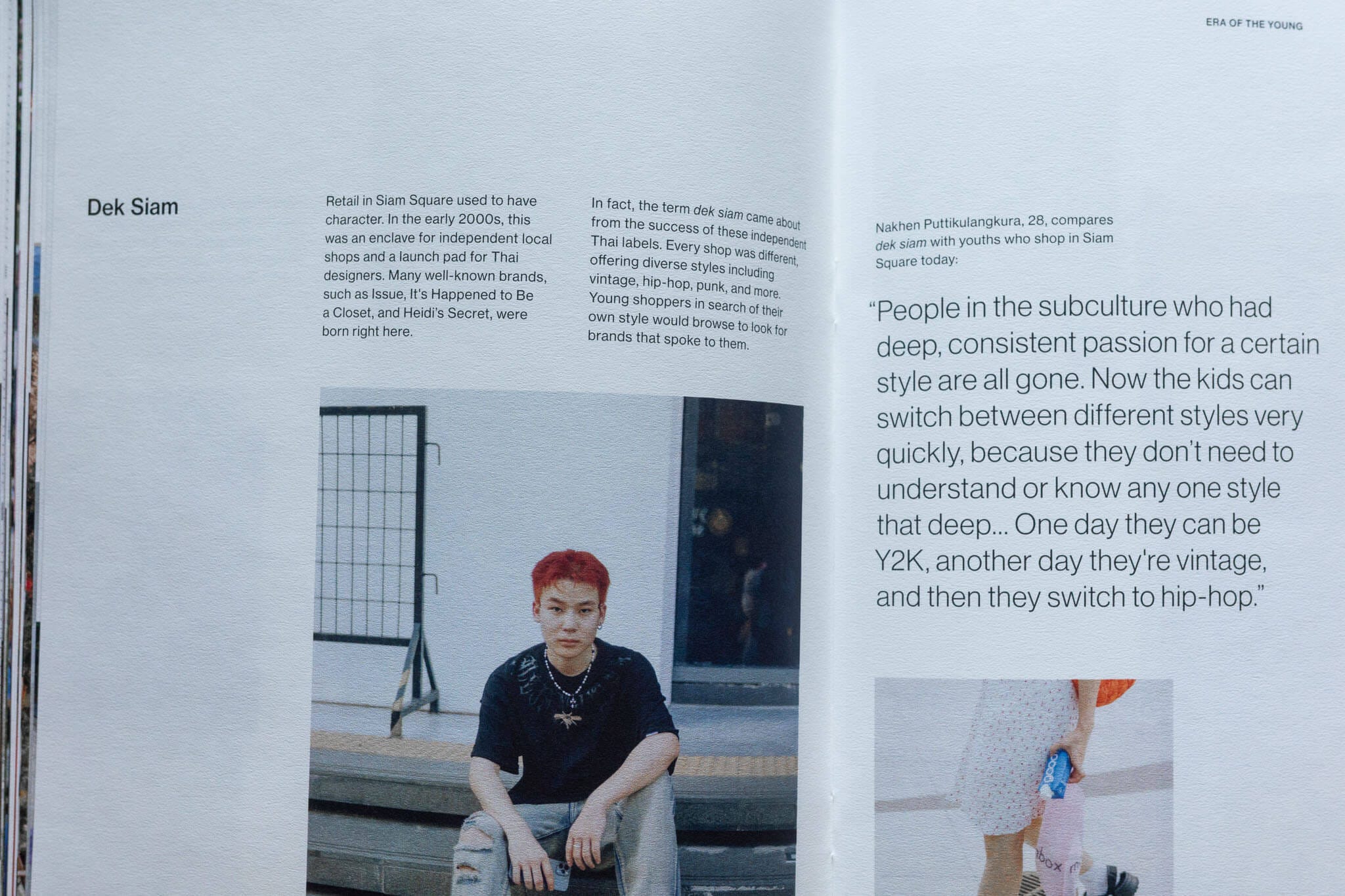
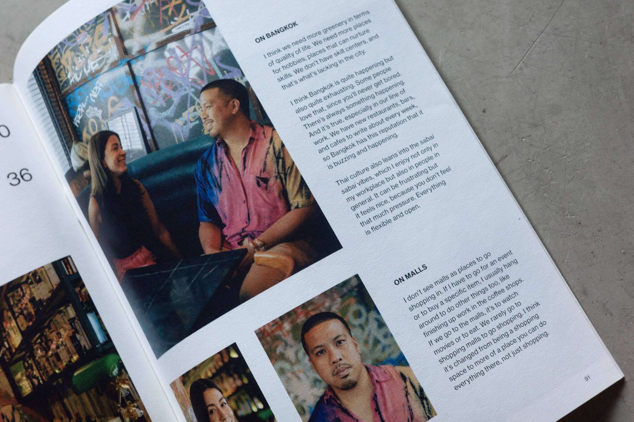
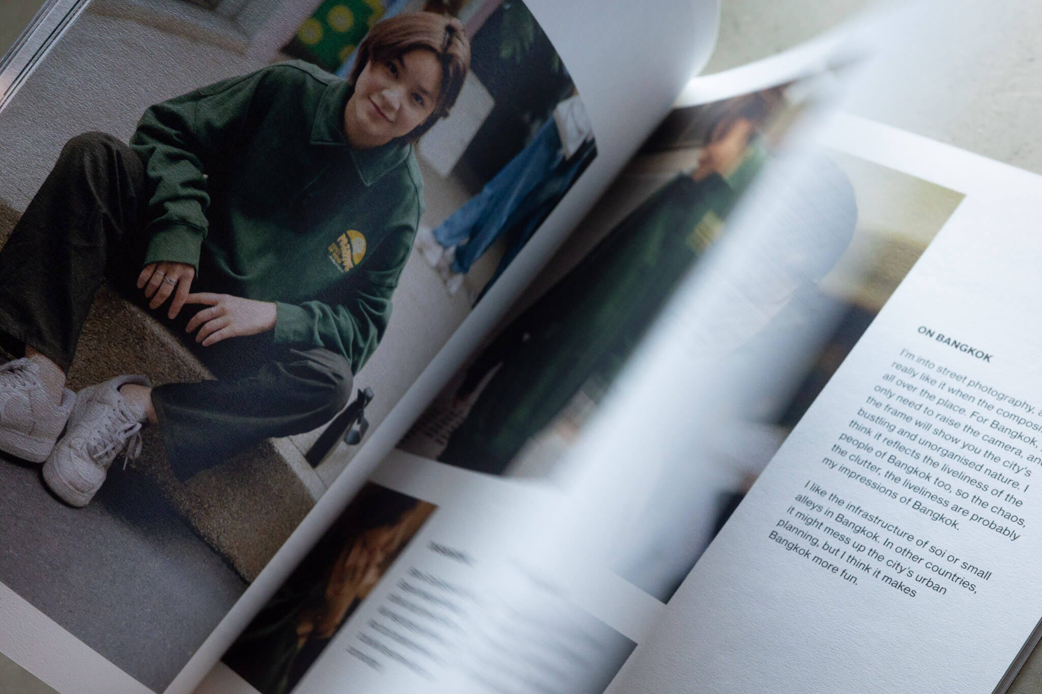
After three months, we produced a book, printed ten copies, and placed one in front of each executive as we presented. Some findings made them uncomfortable. Some made them smile. Some made them frown and nod at the same time. (When people squirm across a boardroom table, you know you’re onto something.)
You start these things with a hypothesis. A general sense of what you think the truth is. Then you do the research to be less wrong. The point isn’t to predict the future. It’s to understand what people actually think and feel.
I can’t share what was in the report. (NDAs are wonderful that way, and for reasons I still don’t fully understand, I signed five of them for this project.) What I can say is this: the project was completely unlike anything the brand had built before, and needed to be approached in a radically different way.
Naming
“Which stage of the project has been the most difficult?” I asked.
“Naming,” the client answered. “We have another project that’s been stuck on naming for over a year.” She showed me a presentation deck with hundreds of names on a slide, a long list, a short list, a shortlist of the shortlist.
The challenge of naming a building at the centre of youth culture is that words go out of fashion. Quickly. Whatever name we gave it had to work not just for the generation coming of age now, but for the one ten years from now, and the one after that.
I pondered this for a few weeks. One evening at a bar, I circled around the idea of a name drawn from the nuance of the Thai language and asked a friend sitting next to me what repeating a word means here.
I’d heard Thais repeating words for emphasis, such as “aroi mak mak”, a way of saying something is very, very delicious. My friend explained that it’s called Kum Sum (คำซ้ำ), a feature of the Thai language where repeating a word can modify its meaning, create a new one, make something plural, or express something ongoing.
Unlike English's 26 letters, Thai has 44 consonant symbols, 16 vowel symbols, and 4 tone markers. There is, in other words, a lot going on. Repetition is just one of the ways Thais have found to say what a single word can't. And unlike a word, repetition won’t go out of fashion. Generations have used it, and generations from now still will.
But I also knew that "just repeat the brand name" is exactly the kind of idea that gets you either a standing ovation or escorted out of the building. Sometimes both, in that order. It was going to come down entirely to how I presented it.
So instead of presenting it as one option amongst many, I needed to frame it as the only solution possible. (The fewer choices you give people, the faster they decide. Really smart people call this the paradox of choice. I just call it not wanting to sit through another deck with a hundred names on it.)
The client's properties had always followed one of three naming systems.
The first: brand name plus location. Central Bang Na, Central Lad Phrao. In this case that would mean Central Siam, which was a problem. A competitor had already built their entire brand around that word. Siam Piwat, the company behind Siam Paragon, Siam Center, and Siam Discovery, had made it theirs. Every time the name appeared, it would remind people of the competition. Not great.
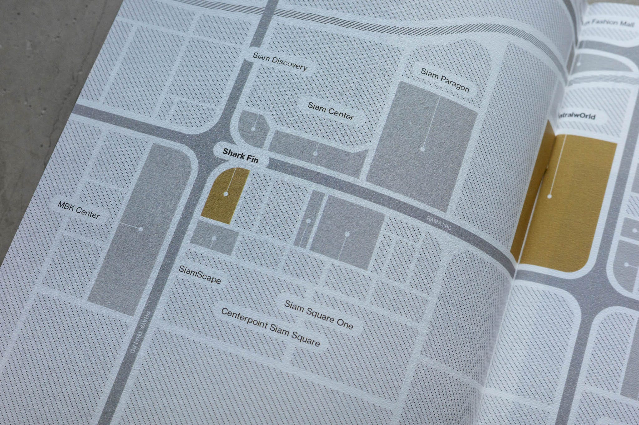
The second: brand name plus a word reflecting the heritage of the site. centralwOrld, named after the previous World Trade Center. Central Embassy, named after the embassy that stood there before. In this case that would mean Central Scala. Naming a building after a demolished cinema you're replacing is like getting a tattoo of someone you're trying to forget. Every time someone said the name, they'd be thinking about what used to be there. Also not great. The name needed a clean break from the past.
The third option was to coin something new: a word that would, given enough time and money, eventually mean something to people. You're probably familiar with these. Words that seem to mean something but mean absolutely nothing. The kind of name that gets chosen when a brand runs out of ideas and a creative agency starts copy-pasting from a thesaurus. They're also, as it turns out, how most buildings in Thailand get named. I threw dozens of these at the wall, from the banal to the high concept, and showed how every single one needed years of marketing budget just to become recognisable. (If you've ever wondered why so many buildings are named after celestial objects or words like "Infinity" or "Zenith", this is why. Someone ran out of ideas and reached for the sky. Literally.) So that was out too.
Which slowly but surely led us to a very simple answer.
A name that was completely new and timeless at the same time. One that didn't need years to accumulate meaning, because it already had it. One that worked for the generation coming of age now, and the one after that, and the one after that.
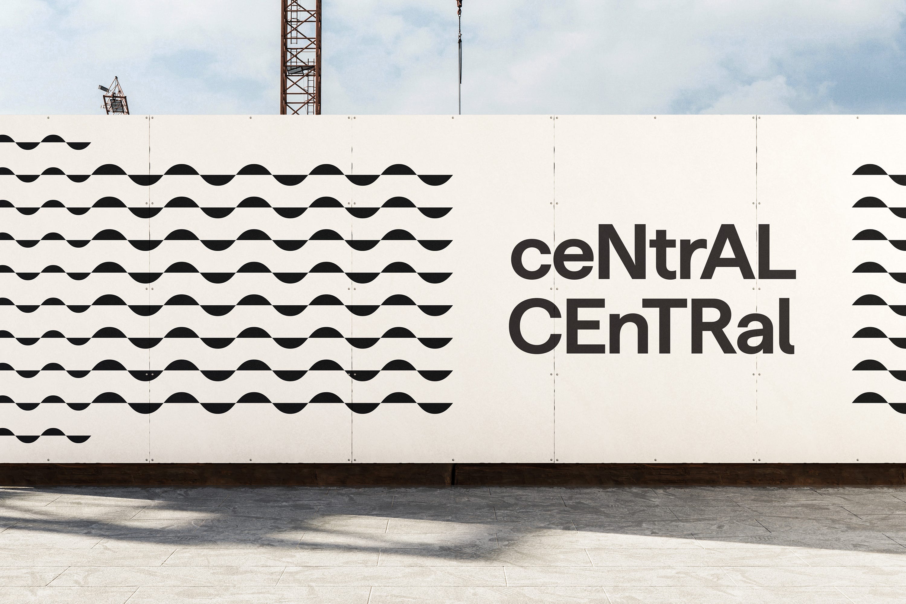
Central Central.
They loved it. Cleared in the first round. We moved on.
Identity
Designing an identity for a building is either really fun or really uninteresting. There's only so much you can do. It has to be legible from far away and legible when seen really small. It has to work as signage, on digital, on print, and ideally really well in motion too. It has to be on strategy. It has to be a logotype, it may or may not need a logomark. It needs to stand out against the competition yet blend in with the rest of the master brand. There's a lot at stake for something a fresh grad from art college could bang out in twenty minutes on Canva. Forty-five, if you count the research done on Pinterest.
Most building identities come down to one of two approaches. Choose a font, customise it slightly, and spend two weeks writing about why every curve represents the eternal spirit of the brand. Or create a custom typeface, name it Brand XX Pro, and have someone explain that "the angle of the stem echoes the dynamic energy of youth in motion." If you've wondered why so many rebrands come with a custom typeface, this is why. Someone ran out of ideas. Nobody questions it. Everyone just wants to go for lunch and feel like they accomplished something ground-breaking.
In our case, we had done the research. Which meant we had no excuse.
The identity had to have the same attitude as the naming system. Fortunately, Kum Sum (คำซ้ำ) gave us a starting point. If the name worked by repeating something familiar in a new way, the identity had to do the same. Always shifting, never fixed.
We looked at how youths communicated and, no surprises, texting is the dominant form. They're always finding new ways to express themselves through it. One of those ways is capitalisation.
Upper case is for emphasis, exclamation, seriousness. Lower case is casual, soft, not trying too hard. And then there's aLteRnaTiNg cApS. A way of typing that's been around for decades, used to express personality, playfulness, attitude. Young without being trendy. It doesn't go out of fashion because it was never really a fashion to begin with.
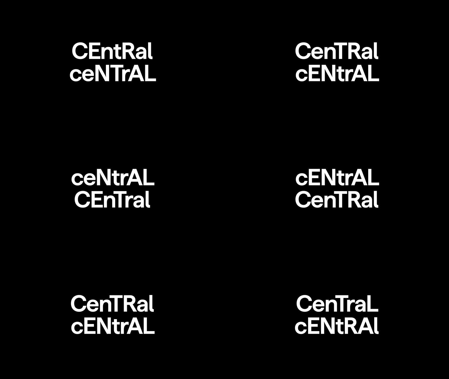
Which meant the logo didn't have to be one thing. It could be infinite. Flexible, typable, movable. You'd almost never see the same version twice.
It could morph from the building name to a tenant's name to a person's name and still feel like the same identity.
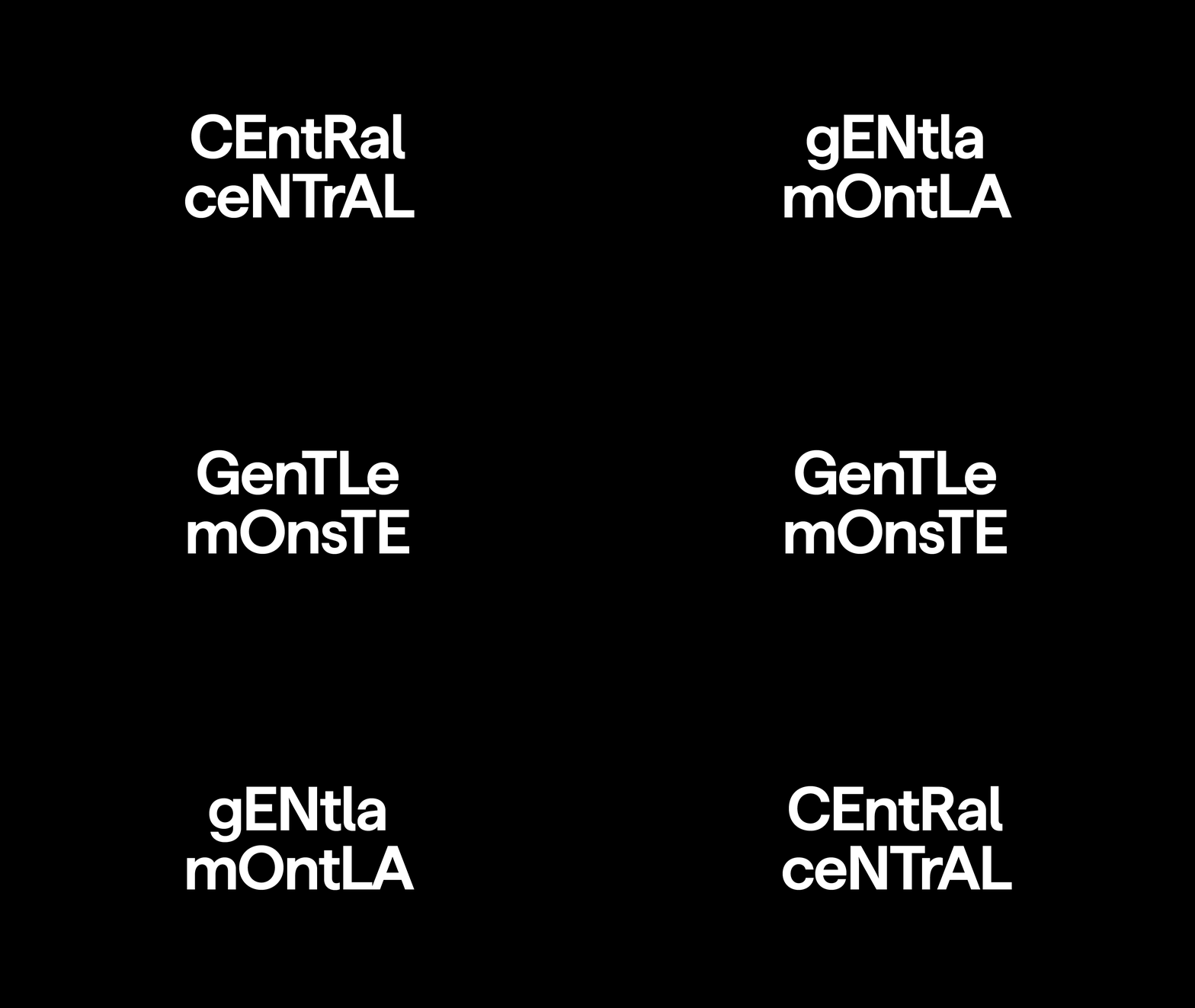
You could feel the brand even without seeing the logotype. The identity was a typographic system that could be applied to anything.
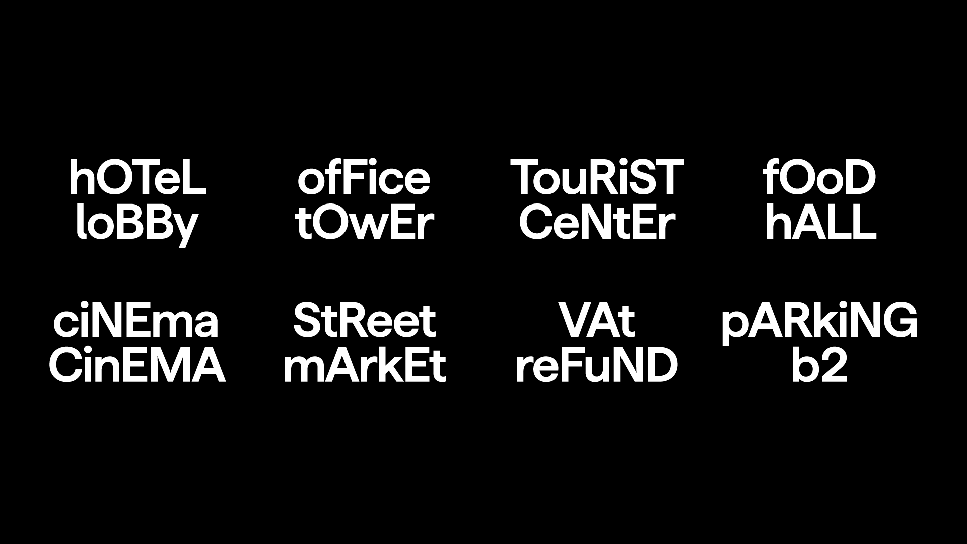
It would work well on a digital sign running at the top of the building, moving against a sea of static competitor logos. As if we were planting a flag in Siam.
This too was cleared in the first round. Two for two. Either we were very good or very lucky. It was also 11am on a Friday, so maybe everyone just wanted to go for lunch. (After twenty-one years, I've stopped asking which.)
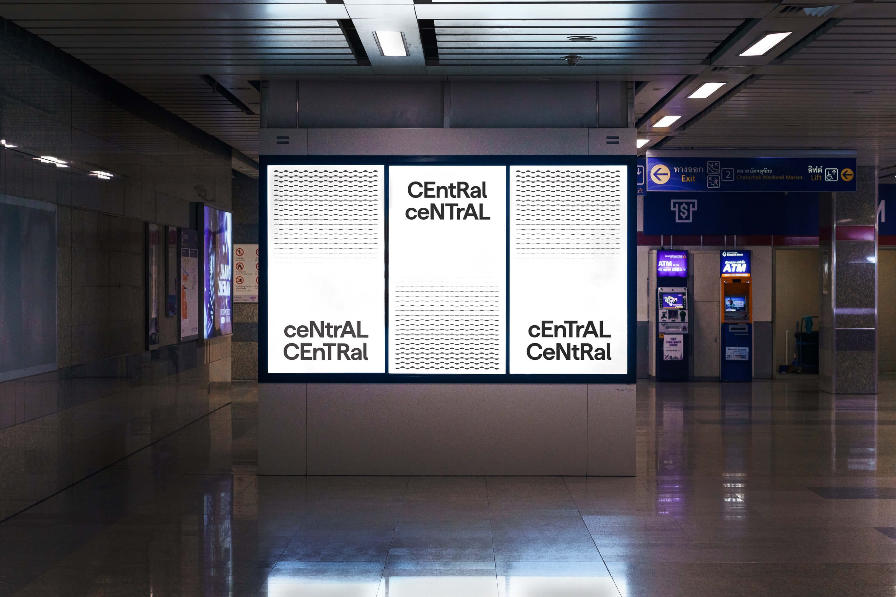
Branding graphics
The last step was to develop a branding graphic system. (Technically the brand guidelines come last, but brand guidelines are the most important document nobody ever reads. The designers who wrote them know this. They wrote them anyway.)
Branding graphics are tricky. At their worst, they're a forced attempt to create a motif that means nothing, used as decoration to fill space. I've seen enough case studies to know that the logic behind most of them doesn't always hold up to scrutiny. Something about a crescent moon facing the north star… Or circular forms representing the infinite cycle of human connection… You get the point. Does it look nice? Sometimes. Does it mean anything? Rarely. Does anyone ask? Almost never.
The question was how to create something that carried the same attitude as the name and identity. Something with an easter egg buried in it. A detail that revealed itself the closer you looked.
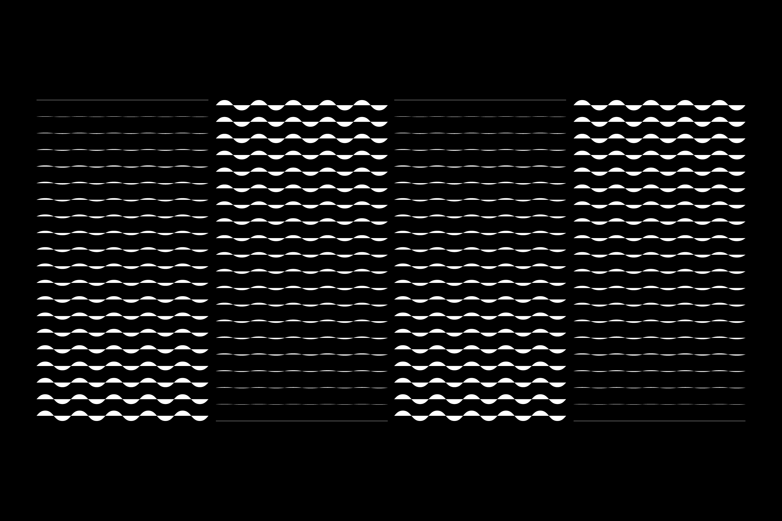
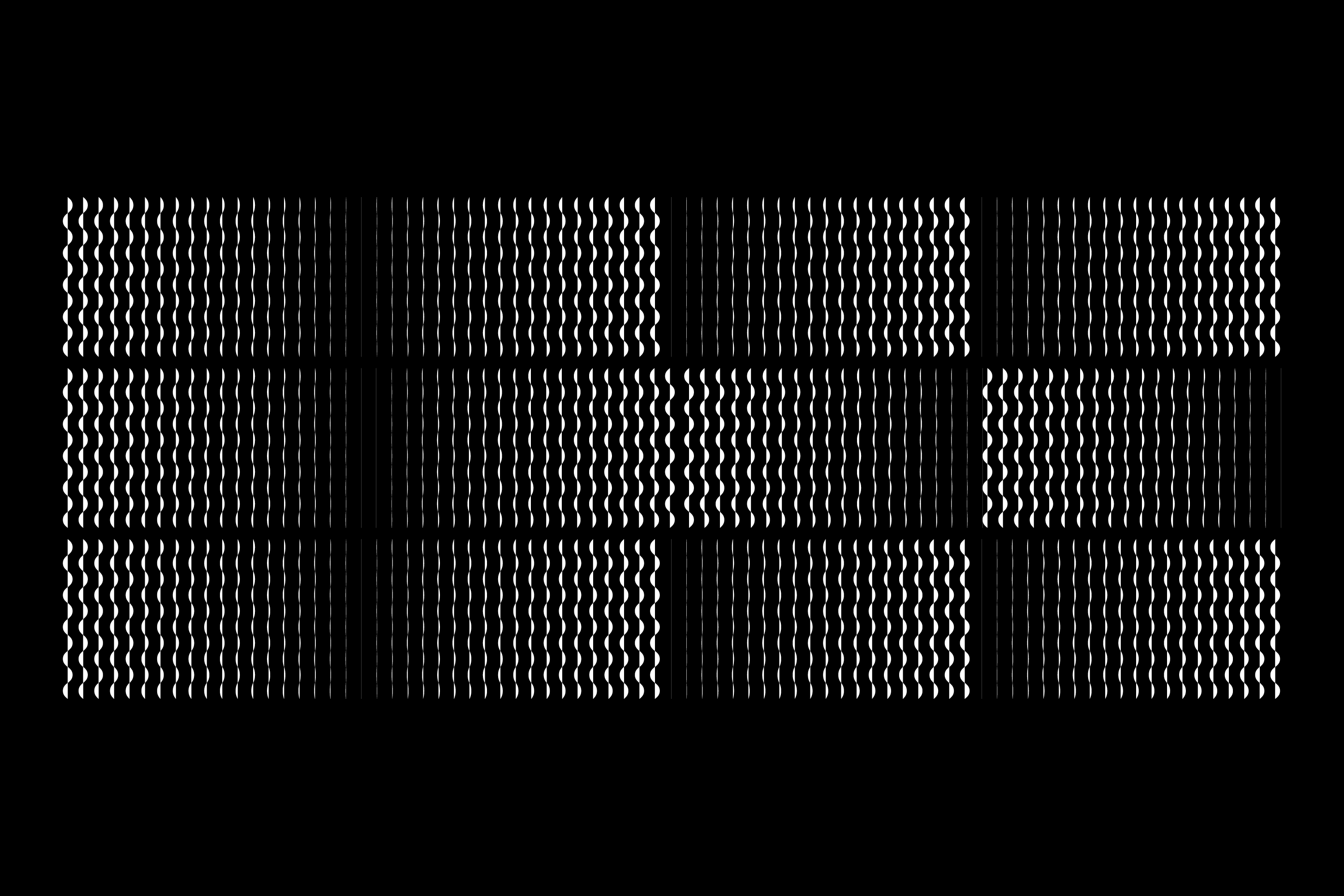
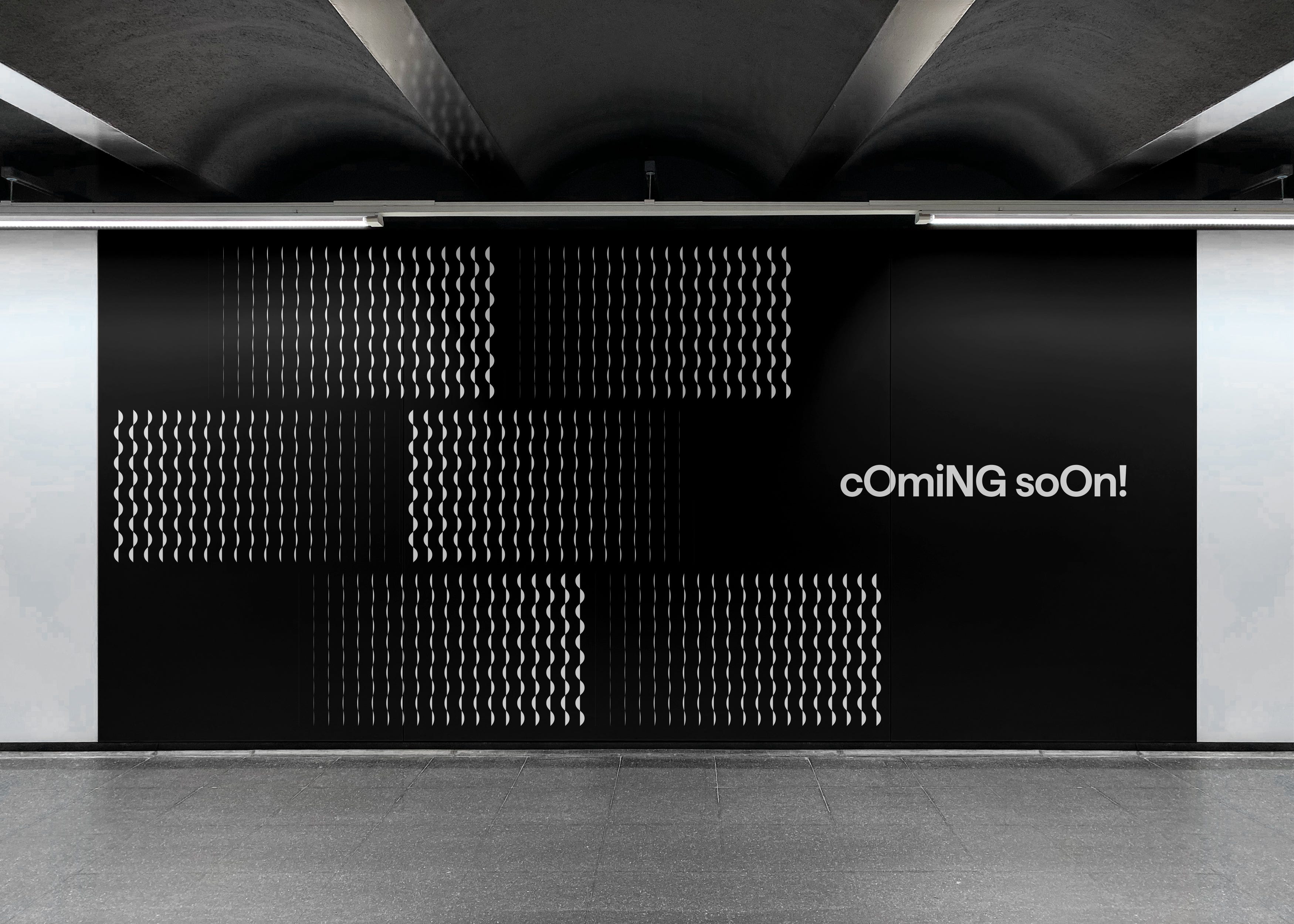
We went back to the logotype. Pulled out the upper case C and the lower case c from the alternating caps system, and built a simple set of four wave patterns from them. Enough to create a sense of energy and movement. Simple enough that someone else could pick it up and run with it.
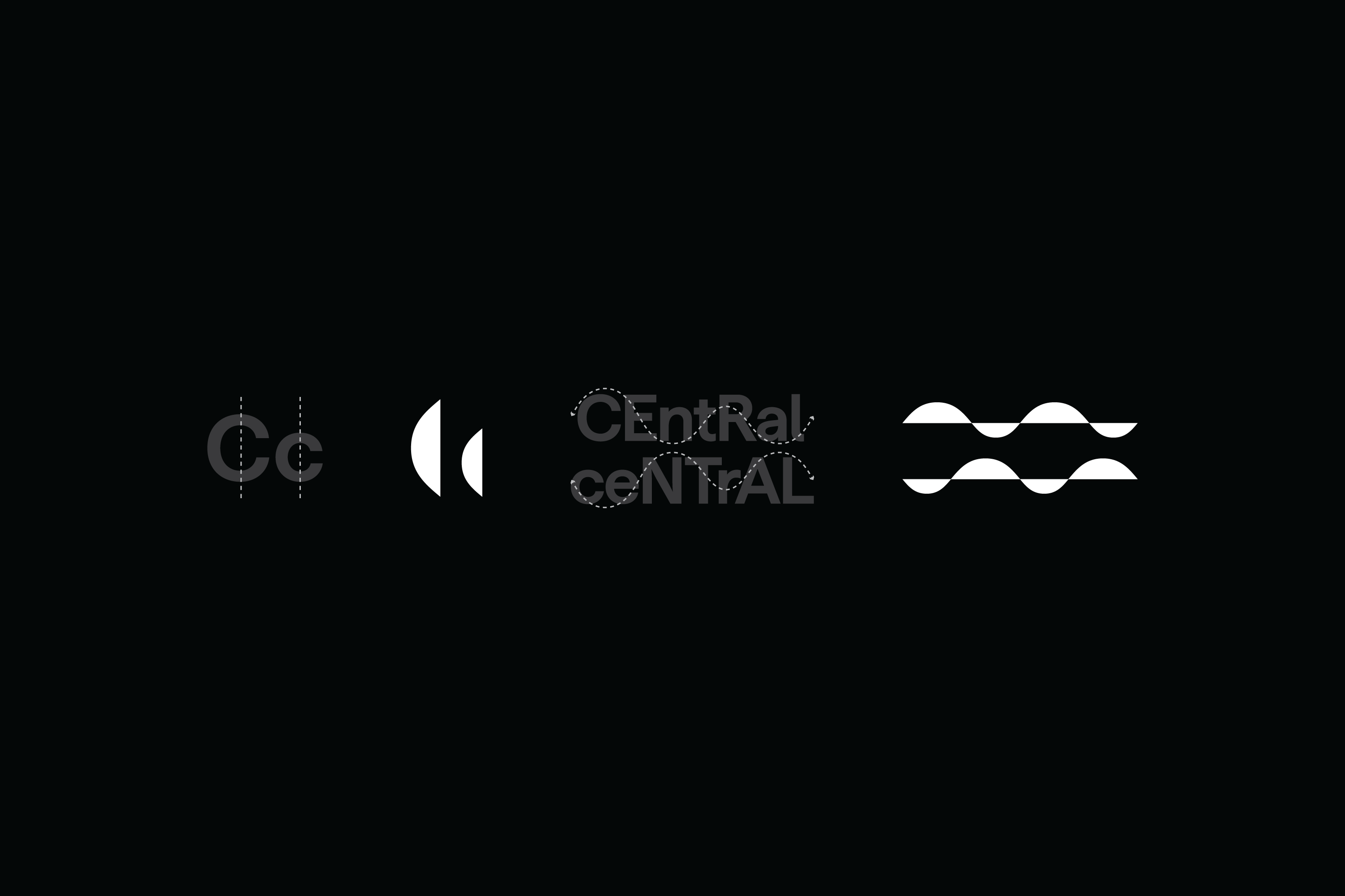
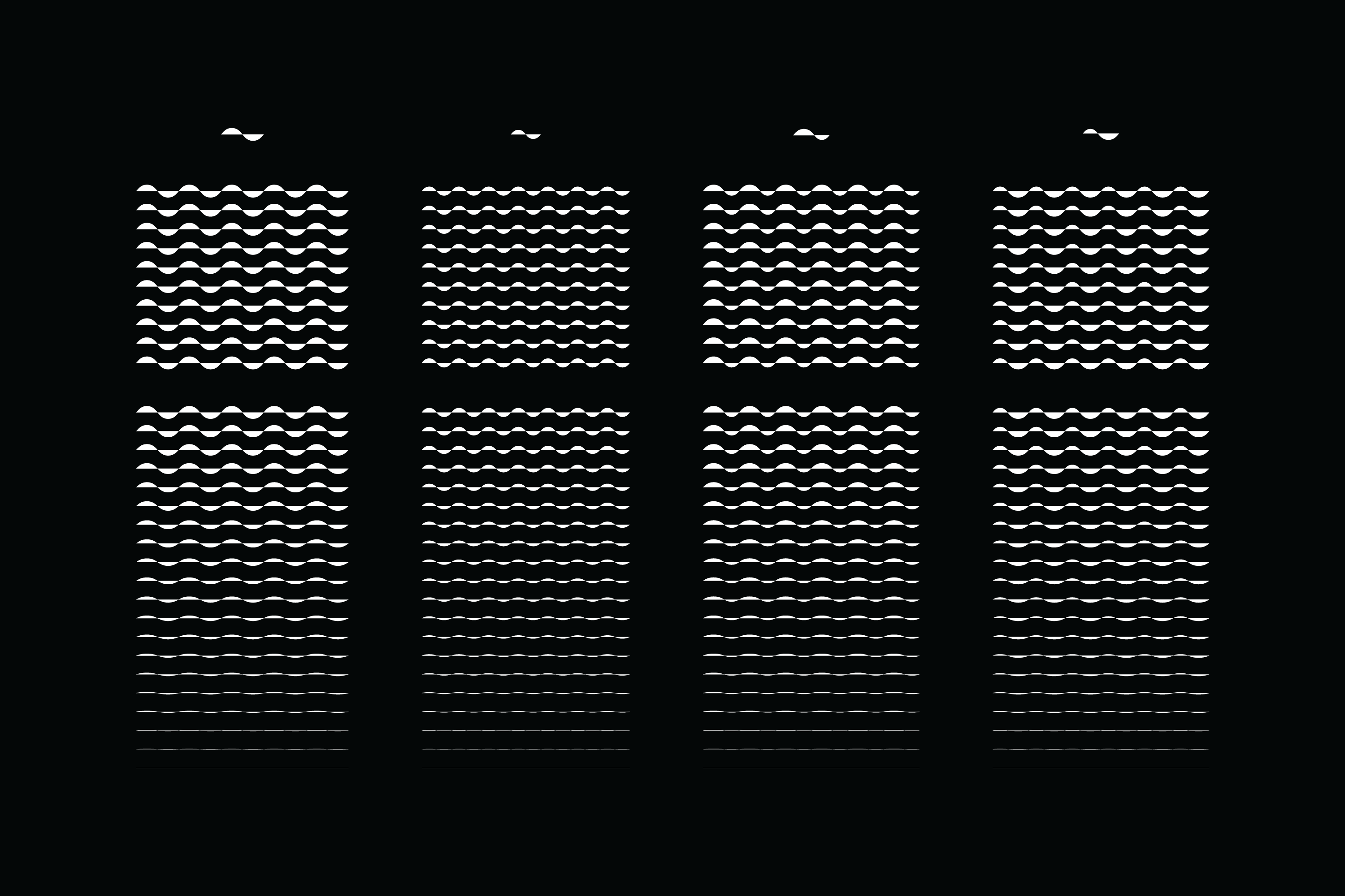
That last part matters more than people think. A branding graphic system is only useful if the people who inherit it can adapt it without breaking it. So we built a guideline for how the elements could be merged, stacked, remixed, cut, and assembled into endless combinations. Hoarding boards, digital, print, wall textures, building facades, merch. The same four shapes, infinite outcomes.

Epilogue
Over the years, a few friends have asked why we don't post much on social media. After fifteen years of using it, I'd had enough. But also, projects like this sit under NDAs for years before anyone can talk about them. And even when they're announced, it's become harder to tell the making-of story in a way that doesn't feel like a highlight reel. Everything gets condensed into a thirty-second video or a carousel post, because "people don't read anymore" and "have short attention spans."
They're probably right. I'm writing this anyway.
This field note is my attempt to tell the fuller story. Not the best bits, but all the bits. The thinking behind the thinking. The dead ends. The conversation at a bar that somehow became a naming system. A case study would dress this up with nice photography and an animated colour palette revealing itself to a royalty-free piano track. This is not that.
So if you've made it this far, congratulations. You belong to a very small group of people who still read. Thank you for that. You either really care about branding, really care about malls in Bangkok, or you're procrastinating on something important. Possibly all three.
—
Felix Ng
Co-founder, Anonymous
@felix.anonymous